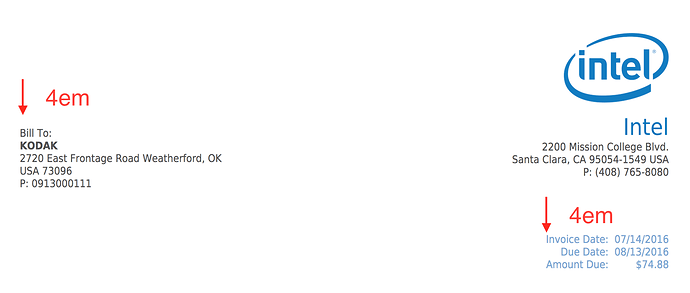
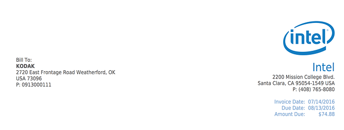
Hi, I am not familiar with css, I’d like to make the “Client header” same alignment with “Company Header”.
I did add margin-top: 4em in header property in custom.css but the invoice date will go down as well.
#header
table{width:100%;padding:0;margin-top: 4em}.
How to make Client header same alignment with company header but the invoice date details space only 1em from company details.
Thanks all.
I wanted to do something similar and added a blank table row<tr></tr> in the invoice template as a workaround.
And Kodak is in Rochester NY!
Hi cactus12,
thanks for your reply, does it mean I don’t need to customize the custom.css? and where should I add the blank table row?
and for Kodak’ address, I just used it as a sample 
You can add blank rows for more space in the template as a workaround if you don’t know CSS. For less space, I think you’d want to do the same thing in the custom.css for invoice_details table that you did above. If you play with margin-top and margin-bottom values for those two tables you should be able to get the layout you want.


